
You are currently browsing the tag archive for the ‘turquoise’ tag.
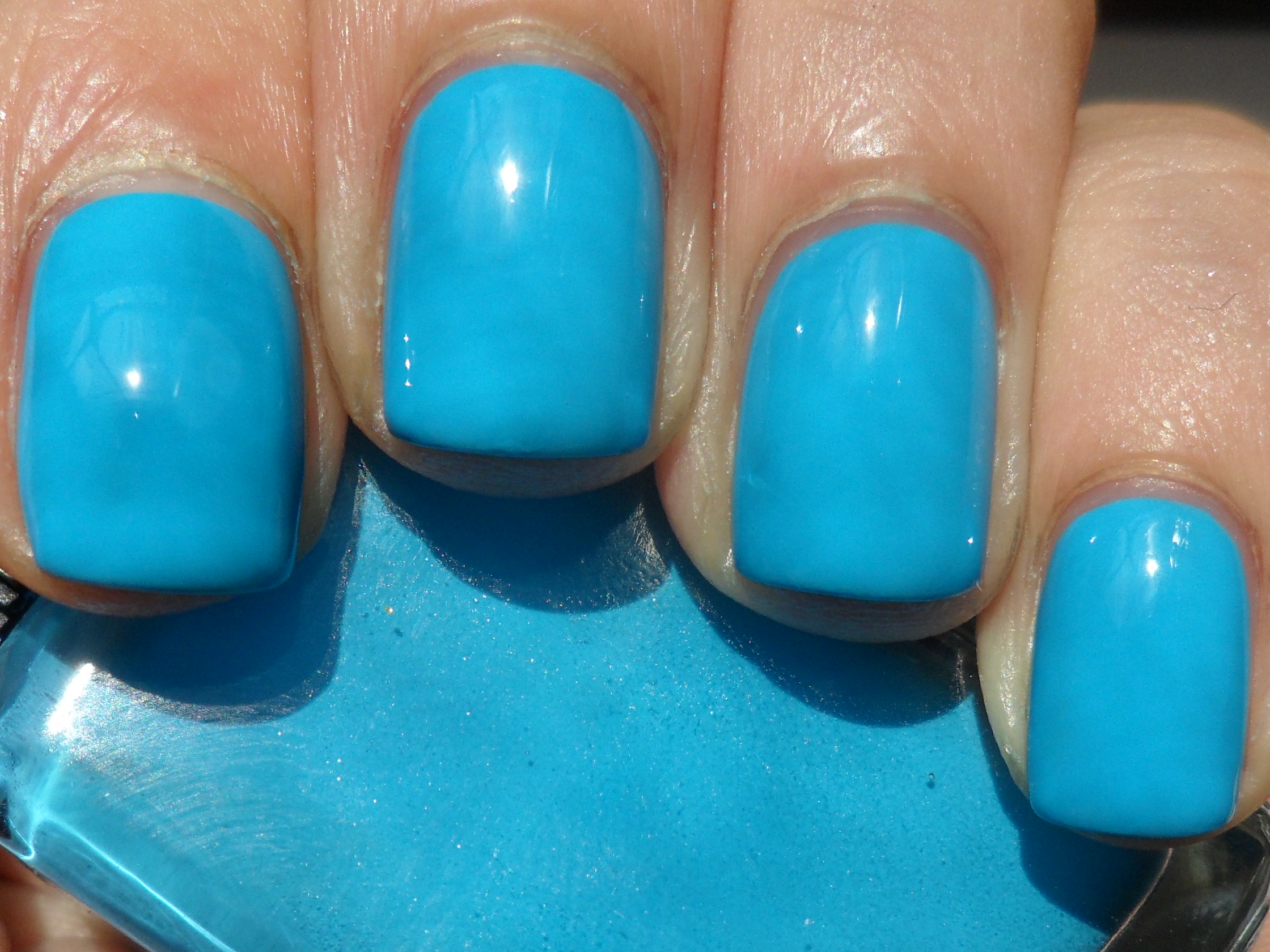
After wearing and loving Cameo so much, I was really looking forward to trying the polish I bought along with it. Illamasqua Noble is a vibrant robin’s egg blue creme:
 \
\
Picture taken in sunlight. The formula was smooth and applied well in two coats, plus some touchups. Just like Cameo, this color was very bold; it has a great, strong presence on the nail. But while Cameo was a soothing, calming type of color, this shade is incredibly bright and vibrant. I’m used to seeing robin’s egg blue in lighter or pastel forms, so it’s nice to see something a bit different. This was so bold that I was almost inclined to call it a teal! Whichever way this shade is defined, it’s absolutely stunning. Though it can probably work year-round, I’m glad I tried it at this point in the summer. It makes me think of both water and the sky. I paired this with Chanel Riviera on my toes.
<3sarah
I tried half of this collection a couple of weeks ago, and I’ll try the other half over this weekend (at least I think this collection has four polishes in it; they were the only ones I saw that had ice cream stickers on the cap.) Nails Inc. Royal Botanical Gardens (Spring/Summer Trend, 2013) is a pastel greenish turquoise creme:

Picture taken in sunlight. I expected this to be streaky, as light pastel colors tend to be, but the formula was also nicely thick and pigmented, so I got full coverage in two coats with some touchups. I love turquoise polishes the most in creme form, so I was defintely drawn to this. This pretty shade is unmistakably turquoise, but it leans ever so slightly more green than blue. It has that light, sweet pastel look, but the color is pigmented enough to look bold and stark instead of pale. When I wear them in the summer, turquoises like this also make me think of the beach. 🙂 I paired this with NARS Anardana on my toes.
<3sarah
I tried one half of this collection in May, and this month I’ll wear the second half, starting with Essie In the Cab-ana (Resort Collection, 2013), a bright, aqua-turquoise creme:

Picture taken in sunlight. The formula was nicely thick and pigmented, and I got full coverage in two coats, with some touchups in between. When I bought this I thought the color would be really similar to Where’s My Chauffeur?. They are, in the sense that they’re both in the same broad color family, but they’re not as close as I thought. Where’s My Chauffeur? leans on the green side of turquoise, while In the Cab-ana leans more on the blue side. There are also differences in formula; In the Cab-ana has a thicker, more solidly opaque consistency. Both are bold and really pretty; this one makes me think of lovely turquoise seas as well. I paired it with Illamasqua Purity on my toes.
<3sarah
I’m finally finished trying this collection with Essie Where’s My Chauffeur (Winter 2012), a bright, greenish turquoise creme:

Picture taken in sunlight. (This looks just a little greener in real life.) This applied smoothly, though the formula didn’t quite have that really solid pigmentation. I needed three coats for full, streak-free coverage. It did turn out to have a pretty strong presence on the nail, even without that creamy, solid, pigmented type of formula. It’s kind of strange to think of this as part of a winter release, since this color seems so summery. I can’t resist a turquoise! This one leans a little on the green side. Turquoise shades are typically light, but I like that this one is actually pretty bold and bright, and not washed-out and pale. I feel more at home trying it at this time of year. It’s so pretty and makes me think of a gorgeous turquoise sea. I paired this with Sephora by OPI It’s My Pink on my toes.
<3sarah
This collection is mostly made up of different shades of gold, silver and bronze. The colorful exception is China Glaze Metallic Muse (Khrome, Winter 2009), a seafoam turquoise metallic shimmer:

Picture taken in sunlight. This applied well in two coats; it went on very smoothly over two coats of basecoat. It’s a good thing the formula is pigmented; it’s best to use as few swipes as possible because the more brush strokes you make, the more you open the mani up to cuticle drag. I think this is because the polish dries so fast so extra swipes of the brush drag along spots that are already dry. That’s also why it’s better to do thin coats, as thicker coats would dry too fast, which causes major bubbling. This sort of formula may be finicky but the payoff you get with the look of the finished mani is great. The shimmer is quite fine for a shimmery metallic but it does the big job of covering up brushstrokes and avoiding the dreaded frosty appearance. I love this color! It definitely stands out among the rest of the polishes in the collection, which are more neutral. It’s silver-toned, but unlike Sci-Fi, which was lavender-tinted but still mainly silver, this one is predominantly turquoise. It can shift between looking bluer or greener depending on the light. It makes me think of the sea and mermaids; it’s really pretty. I paired this with OPI We’ll Always Have Paris Suede with topcoat on my toes.
<3sarah
I’m wrapping up this month’s run of blues and greens with my next Brit-themed polish for the Championships. Nails Inc. Haymarket is a turquoise-jade creme:

Picture taken in sunlight. This applied well; the formula was thick, smooth and pigmented so I got full coverage in just two coats. I love this color; it’s soft, but it doesn’t look like a typical dusty polish. This may be a soft sort of shade, but the finish actually looks crisp. I think the solid pigmentation definitely helps it have a strong, well-defined presence on the nail. I wouldn’t call it stark, but it has a certain clean brightness to it. The color itself is a pretty blend of turquoise and jade, which is the only way I could describe it. I was planning on putting this on anyway, but wearing something from one of my favorite color families is a definite pick-me-up after the awful sports-watching day I had yesterday. Seeing Rafa Nadal crash out at Wimbledon, Germany losing at Euro, and the Yankees blowing a lead (not to mention losing Pettitte and Sabathia to injury the previous day) is a lot of letdown for one day. 😦 I paired this with Orly Cotton Candy on my toes.
<3sarah
While I’ve just worn a turquoise polish, the color comes in such a wide spectrum of shades that I don’t feel like I’m wearing the same color today. Color Club Blue-Ming (Blossoming, Spring 2012) is a bright pastel turquoise creme:

Picture taken in sunlight. This applied well and was pretty pigmented. The formula can be prone to cuticle drag, and I couldn’t quite get full, solid coverage in two coats, so I used three. This is now one of my favorite turquoises I own. It’s a very stark pastel so it has a lovely strong presence on the nail. I can say that about any good pastel creme, but this one is so bright that it almost crosses over into neon territory! I’m not inclined to call it a neon because the formula doesn’t behave like one, but there’s something about the color that’s really glowy. I don’t really like punny polish names, especially when it’s an inaccurate indicator of the color. This one is more of a green-leaning turquoise, and I already have another color in mind when I think of Ming dynasty ceramics. Whatever name is attached to this polish, I absolutely love it. Pastel turquoises are not unique, but this one definitely stands out among them. I paired this with Orly Hot Shot on my toes.
<3sarah
For the next of the blue/green shades from this collection, I have on China Glaze Kinetic Candy (Electropop, Spring 2012), a pale pastel turquoise creme:

Picture taken in sunlight. Although the formula was a little streaky, it applied well, and because of its thickness and high pigmentation, I got full coverage in only two coats. I absolutely love this; it’s so pretty and sweet-looking! It’s a blue-leaning turquoise; I think it has just a drop a green in it that makes it look turquoise and not baby blue. It has a sort of dusty appearance, but at the same time its stark pastel quality makes it look bright. “Stark” and “dusty” seem incongruous but somehow this polish has both qualities. As with other pastels, it really does make me think of candy. I paired this with Essie Lovie Dovie on my toes.
<3sarah
For the first time in four slams, I’m not celebrating Novak Djokovic winning one. He didn’t complete the “Nole Slam” (partly due to Rafa Nadal’s unbelievable play on his way to a record seventh Roland Garros title) and the career slam still eludes him, but now I look forward to Wimbledon, and I continue with June’s blues and greens. China Glaze Aquadelic (Electropop, Spring 2012) is a bright turquoise creme:

Picture taken in weak sunlight. The formula was nicely thick and pigmented (similar to a pastel, although I don’t think it’s truly one); I got full coverage in just two coats. Out of all the polishes in this collection, I knew I wanted to try this first. Like my love of teal, I can’t resist any shade of turquoise. This one leans on the greenish side. It’s so sweet and pretty! Like I mentioned, it does seem like a pastel because it’s light (but turquoise is a light color anyway), and does have that stark-like presence and definition on the nail. However, it’s actually a bold shade, especially compared to the paler pastel turquoises. It takes the best qualities from bright and pastel polishes, saturated color and stark crispness. It’s beautiful to look at, a definite must for turquoise lovers. I paired this with Essie Funny Face on my toes.
<3sarah
I knew it wouldn’t be long before I tried another turquoise this month. Color Club New Bohemian (Back to Boho, Fall 2011) is a turquoise green creme:

Picture taken in sunlight. This applied well, but the formula was a little cuticle-draggy. I needed three coats for even coverage. I thought this was similar to another polish I tried earlier this month, American Apparel The Valley, but, looking at these turquoise polishes side-by-side, New Bohemian is much greener, while The Valley is more of a robin’s egg blue. Wherever it lands between blue and green, any shade of turquoise is pretty to me! This one is light (turquoise is a light color anyway) but still colorful and bright. Looking at it makes me want to relax on the beach. I paired this with OPI Ate Berries in the Canaries on my toes.
<3sarah
