You are currently browsing the category archive for the ‘creme’ category.
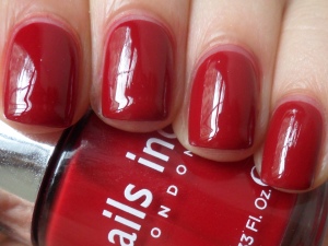
It’s been a hectic few days; I’ve just relocated to Paris! I meant to post this NOTD before I left but never got around to doing it. Nails Inc. Tate is a deep blood red jellyish creme:
Picture taken in natural light. This applied well; this could probably qualify as a “crelly” because it’s slightly translucent (more so than a creme that’s just not highly pigmented), but has a degree of opacity that keeps it from being a true jelly. I still used three coats for full opacity. The color definitely deepens from the second to third coat, so if you wanted to keep the color brighter, it still looks okay at two coats. This is definitely one of those classic reds that could be that one staple in someone’s collection (not me, though, since I can’t keep track of how many red cremes I have. :)) This one seems to look different under various lighting conditions; sometimes it looks like it has a brown tone to it, and other times it looks like a very deep cherry red. This was the last Nails Inc. polish I have that was still untried, so I’m glad to have worn it. I paired this with China Glaze Calypso Blue on my toes.
<3sarah
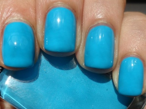
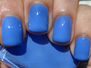
After wearing and loving Cameo so much, I was really looking forward to trying the polish I bought along with it. Illamasqua Noble is a vibrant robin’s egg blue creme:
Picture taken in sunlight. The formula was smooth and applied well in two coats, plus some touchups. Just like Cameo, this color was very bold; it has a great, strong presence on the nail. But while Cameo was a soothing, calming type of color, this shade is incredibly bright and vibrant. I’m used to seeing robin’s egg blue in lighter or pastel forms, so it’s nice to see something a bit different. This was so bold that I was almost inclined to call it a teal! Whichever way this shade is defined, it’s absolutely stunning. Though it can probably work year-round, I’m glad I tried it at this point in the summer. It makes me think of both water and the sky. I paired this with Chanel Riviera on my toes.
<3sarah
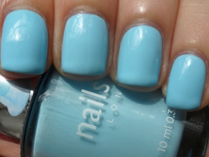
The last of these polishes I have to try is Nails Inc. Chelsea Physic Garden (Spring/Summer Trend, 2013), a pastel sky blue creme:
Picture taken in weak sunlight. (A rare photo on the second day of wear.) This applied much like Royal Botanical Gardens; the formula looked streaky on the first coat, but was quite thick and pigmented, so with a few touchups I got full coverage in two coats. Just like turquoise, I’m always drawn to this sweet type of pastel sky blue whenever I see it in a collection. It may be light, but it’s definitely not pale. It’s stark and pigmented enough to have a strong presence on the nail, yet looks pretty and delicate at the same time (a quality I always love to see in a pastel). It’s also a very calming shade; it makes me want to lie in the grass and look up at the sky. 🙂 I paired this with OPI Dutch Tulips on my toes.
<3sarah
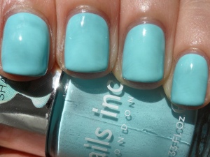
I tried half of this collection a couple of weeks ago, and I’ll try the other half over this weekend (at least I think this collection has four polishes in it; they were the only ones I saw that had ice cream stickers on the cap.) Nails Inc. Royal Botanical Gardens (Spring/Summer Trend, 2013) is a pastel greenish turquoise creme:
Picture taken in sunlight. I expected this to be streaky, as light pastel colors tend to be, but the formula was also nicely thick and pigmented, so I got full coverage in two coats with some touchups. I love turquoise polishes the most in creme form, so I was defintely drawn to this. This pretty shade is unmistakably turquoise, but it leans ever so slightly more green than blue. It has that light, sweet pastel look, but the color is pigmented enough to look bold and stark instead of pale. When I wear them in the summer, turquoises like this also make me think of the beach. 🙂 I paired this with NARS Anardana on my toes.
<3sarah
I was wearing mostly blues and greens in June, but I had a couple of extras that I didn’t get the chance to try; this is one of them. Illamasqua Cameo is a bold cornflower blue creme:
Picture taken in sunlight. This applied well, going on smoothly in two coats, with touchups in between. This is a gorgeous shade of blue! It looks soft and slightly dusty, since cornflower blue just has that quality to it, but it looks bold at the same time, since it’s so highly pigmented. I can’t even remember when I bought this, but I’m pretty sure it was cold outside. I’m not sure if this even belongs to a seasonal collection (this was a Sephora exclusive but now it’s also sold through Illamasqua’s website), but it seems perfect to wear now. The color is so calming; it makes me think of warm, breezy summer days (Summer isn’t even over yet and I’m already feeling nostalgic about it!) I paired this with Chanel Mistral on my toes.
<3sarah
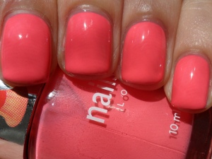
I feel like I’ve been trying a lot of corals this summer, yet I’m not tired of the color at all, since it comes in such a wide range of shades. My latest is Nails Inc. St. James Park (Spring/Summer Trend, 2013), a bold pinkish coral creme:
Picture taken in sunlight. This applied well, though at the first coat it was a bit streaky in appearance. I still managed to get full, even coverage in two coats, with some touchups in between, because the formula was highly pigmented. I really, really love this pinkish coral, though that doesn’t surprise me because another favorite coral creme of mine, Brook Street, is also from Nails Inc. St. James Park does look pretty similar to Brook Street; they are both pinkish corals, but the former has more pink, while the latter has a drop more orange. Back to my current NOTD, this one looks very pretty and sweet because it’s so pink-toned, yet it’s such a bright, punchy color that’s perfect for summer. This is another one that makes me think of fruity, tropical drinks. 🙂 I paired this with Color Club Blue-Ming on my toes.
<3sarah
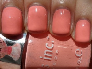
I may be out of neons to wear, but I still have plenty of summery polishes to try this month. I’ll start with Nails Inc. Kensington Palace Gardens (Spring/Summer Trend, 2013) a sweet, pastel peach-pink creme:
Picture taken in sunlight. This was streaky, but due to its thickness and high pigmentation, I was able to get away with two coats, with some touchups in between, instead of having to do three full coats. This color is so, so pretty! I love the look of pastel peaches, and this one even more so because it’s pink-toned. It’s not very, very stark, like some pastels can be, but the high pigmentation does give it a great, strong presence on the nail. It’s a lovely pop of color, and definitely not pale. Maybe it’s because there’s a little ice cream sundae sticker on the cap, but I definitely get a sweet vibe from this.I paired this with Essie Bikini So Teeny on my toes.
<3sarah
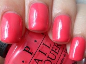
I’m taking a small break from neons by finishing up trying another small collection. I really loved Magazine Cover Mouse, so I was really looking forward to trying the other two polishes I got. First I’m wearing OPI A Definite Moust-Have (Couture de Minnie), a bright, coral-amaranth creme with subtle shimmer:
Picture taken in natural light. (I wish there had been sunlight to take this photo in, but when you enlarge it, you can kind of see the shimmer. It’s also a bolder shade in real life.) This applied very well, going on smoothly in two coats, plus some touchups to cover up dark spots. I wasn’t sure how to define this color, because it looks different in various lighting conditions. Indoors, this seems to have red-orange tones, making it look coral. Outdoors, however, it looks more straightforwardly pink; it reminds me of NARS Anardana. Whatever the color is, I love it! It looks gorgeous in the bottle, and even more so on the nail. The shimmer is very subtle, so at a quick glance it just looks like a creme. Although it’s not that obvious, this kind of secret shimmer does give a little extra something to the finish. I think OPI named this one pretty accurately. 😉 I paired this with NARS Koliary on my toes.
<3sarah
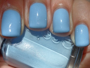
This month has turned into quite an Essie-fest for me; but I just love all the blues, greens, turquoises and teals they’ve released in the past few collections. My latest is Essie Rock the Boat (Summer 2013), a light powder blue creme with subtle, tiny silver flake shimmer:
Picture taken in sunlight. This applied sheer and a little streaky; for full coverage I needed three coats, plus touchups. It self-levels though, so the formula wasn’t so problematic anyway. The shimmer is subtle, so in very low light this would look like a plain creme, but it’s not so subtle that you can’t notice it at all. I really like this kind of flaky, irregular shimmer. It’s quite visible even in only some light. This shade of blue is so pretty; it has such a light, airy quality to it. Something about it seems so relaxing, calming, soothing. I love the name as well; it has me feeling nostalgic. When I hear “Rock the Boat,” I automatically think of Aaliyah; I love her music and still listen to it today! I paired this with China Glaze Pelican Gray on my toes.
<3sarah
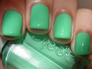
I’ve been trying lots of blues and turquoises, but now I have on something that’s solely green. Essie First Timer (Resort Collection, 2013) is a bright spring green creme:
Picture taken in sunlight. The formula was thick yet runny. It didn’t apply very smoothly but was quite pigmented, so I only needed two coats for full coverage, with some touchups in between to make sure there would be no uneven spots. The formula wasn’t perfect, but I love this color. In terms of blue vs. yellow toned, I think this sits right in the middle; it doesn’t seem to lean either way (which I appreciate, because I feel like I don’t see that so often.) This green is light and springy, but it also has a great, almost neon-like vibrancy. It has a bold, stark quality on the nail, which I love to see in any season, but especially around summertime (I imagine this would look amazing against a tan.) I paired this with Sephora by OPI Alley Cat on my toes.
<3sarah

